Advertisements are a necessity in this technology driven world. Mostly people buy an item in the market after they are aware of that product through the advertisements in the mass media than buy an unknown item.
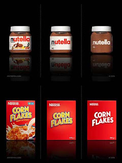
Here is a link to a design consultancy's opinion article I stumbled upon which asks us to prefer one of the three design variations of familiar products in the market. Three pictures of a product are posted in the site - original variation, simple variation and more simple variation. I have posted here some of those pictures.
 |
| I prefer more simpler variation of Nutella and the original design of Corn Flakes |
From the about us section of that website I get to know that this is a minimalism preferring company. Before we blindly decide the designs just by the looks, there are certain aspects that must be analysed.
For example, the market reach of the product plays a vital role in inspiring the design. If a new brand is to be launched in the market, it is best to have a maximalist design so that people get to know what product it is and other information about that product like the ingredients, manufacturer info, etc - this information lets the consumers aware of that new brand.
Whereas, if the brand is familiar it is not apt to design a product glossy and with more details because people are already aware of that brand and it's products. So a simple, succinct and effective package design and brand logo is enough for the people to trust in that brand. If it's designed glossy, it would appear as if the company overdoes itself to impress consumers to it's product.
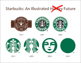
Minimalist design represent class too. Minimalist design would suit better if the products are expensive for example automobile brands, watches, electronics (though the glossy designs won't be apt item specifications are necessary to be added in the item covers.) and all other luxury brands. Consider for example the logo design evolution of Apple, Benz and many other internationally familiar companies. Their logos have evolved in years from being elaborate towards simpler and ingenious designs.
 |
| Evolution of brand logos |
If the target consumers are children, the case is different. Obviously children prefer nutritional drinks (Boost, Bournvita, Milo, etc.), chocolates, so and so items which have to be designed extensively and attractively. Class has nothing to do with children's products.
So factors such as target consumer, product type, elegance, cost of the item, etc., also should be analysed for designing the product packages and the brand logos.
So factors such as target consumer, product type, elegance, cost of the item, etc., also should be analysed for designing the product packages and the brand logos.
 |
| Humorous take on Starbucks logo ;) |
No comments:
Post a Comment
Share your thoughts. :)